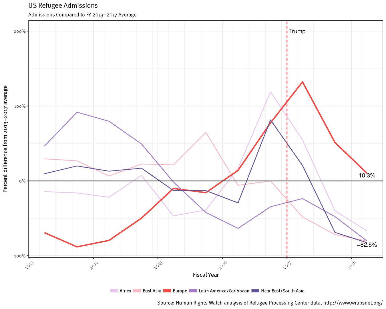
A graph showing US refugee admissions broken down by geographic region of origin, compared to the Fiscal Year 2013-2017 average.
Note: This graph was not published alongside the article by the Los Angeles Times, but is provided as additional Human Rights Watch analysis.
© 2018 Human Rights Watch/ Brian Root